
A Complete Guide to Tile Color Patterns
Are you a one-color person, or do you want the entire rainbow filling your home? Whichever you’d prefer, there are tile color patterns to suit your fancy.
As you’re shopping for tile, color is a key component to keep in mind. Not only do you need to decide what shades you prefer, but you also need to consider how various hues will work together in your design.
You can make the color combos as simple or as complex as you’d like. The following ideas will help you get started on your quest for the perfect color patterns for your tile walls and floors.
Monochromatic
Let’s start with the basics. Monochromatic color schemes are about as simple as they come. The “mono-” prefix on this word indicates that just one color is used.
In some cases, that very simply means one color in one shade. For instance, picture flat white subway tiles lining a wall. Each one is the exact same color.
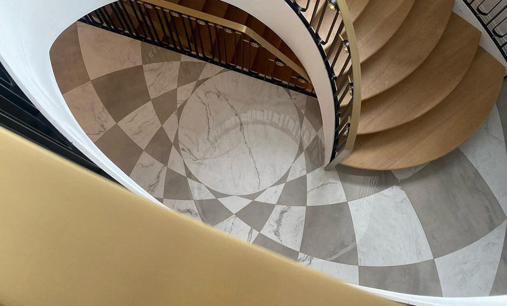
More often than not, though, monochromatic designs involve small variations on the foundational color. Take the gray floor here as an example. At first, it might seem that all the tiles are precisely the same. When you look closely, however, you can see that there is a range of tones involved.

Limestone Field Tile - View Details>>
The effect is more pronounced in this bathroom. All the green tiles fall into the same color family, but they’re far from exactly the same. Even still, this counts as a monochromatic design because it’s built on shades and tints of the base color.

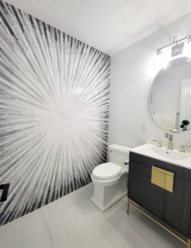
Black and White
Next up on the list of tile color patterns is a true classic: black and white. There are nearly endless variations on this popular duo. Checkerboard patterns are a perennial favorite.

Checkerboard Tile - View Details>>
If you’re looking for a different approach, check out the designs below for inspiration.
Porcelain Waterjet Tile - View Details>>

Geometric Waterjet Designs - View Details>>
Neutrals
Black and white are both considered neutral colors. They're not the only ones; other colors that count as neutrals include tan, gray and ivory.
Neutral colors make a great base for interior decorating. You can use neutral tiles on your floors and walls and then bring in other colors through your furniture, drapery or other elements. Or, in the case of this kitchen, use a neutral backsplash to help a colorful mosaic pop.

Neutral doesn't have to mean boring. Check out this eye-catching design that feature a variety of neutrals.

Abstract Mosaics - View Details>>
Two-tone
What if you want more color in your tile patterns? That can be done! The next step is a two-tone pattern.
This shower stall offers a great example. It features a calming blue that fades into white in the middle of the wall.

Here’s another design with a black and white color scheme, but the results are totally different. The gradient is a repeating pattern across the floor, versus one big gradient along the entire wall.

Penny Round Mosaics - View Details>>
Ombre
Are you looking for tile color patterns that really stand out from the pack? Try an ombre look! Ombre is essentially a variation of a two-tone design because the color transitions gradually from one hue to another. Often, this look involves moving from dark to light (or vice versa).
Here are a few variations on this theme.

Ombre Mosaics - View Details>>
Triadic
A design with three colors is often called a triad.
This wall, for instance, includes light blue, tan and white. Some people might consider it a monochromatic design since two of the colors are neutral. Even still, it gives you an idea of how three colors can work together.

Arabesque Mosaics - View Details>>
When you’re creating a triadic arrangement, it’s best to pick one color to be the main backdrop. The other two colors should be used more sparingly. In that way, you’ll create visual balance.
This bathroom floor involves white, grey, and black the grey is the backdrop and the star of the show, and the white and black play supporting roles.

Geometric Waterjet Tile - View Details>>
Multicolored
Finally, remember that you don’t need to put a limit on your tile colors. If you want to make a colorful splash, you can!
Perhaps you’ll want to create a mosaic that involves a playful mix of colors. Or you may want to use an array of colors in a stunning work of tile art. The beautiful mosaic shown here includes green, yellow, red, blue and more. They come together to make an unforgettable design.

Glass Mosaics - View Details>>
Tile Color Patterns in Your Home
Are you ready to bring your ideas for tile color patterns to life? Reach out to a pro who can make it happen. Our expert design team at Artsaics can turn your color ideas into reality.
If you have no idea where to begin, we can help with that too. The Artsaics designers will work with you to figure out the color scheme that’s just right for your home.
We create full-color renderings of our projects and can often provide color samples too. You can go into an Artsaics project feeling confident about the design and colors you’ve chosen.